Saturday, September 29, 2012

College Football Uniform Grades: Georgia

Georgia Bulldogs


Official Colors: Red and Black
Additional Colors: Silver
Outfitter: Nike
Last Change: 2005

Georgia has one of the most traditional and distinct looks in college football, mainly thanks to a simple design, an iconic logo and really, really important sets of "britches".

In fact, no other college football team puts more emphasis on its pants, rather than jerseys or helmet, like Georgia. The unofficial nickname for the Bulldogs football team has been the "silver britches" for well over half a century.

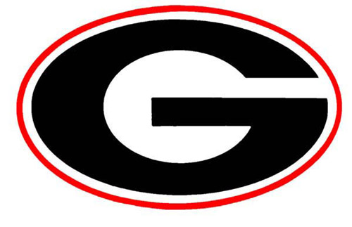
Ironically, it was legendary head coach Vince Dooley that completely cemented Georgia's identity, as it was Dooley that actually dumped Georgia's silver pants in his first season as head coach in the 60s. At the same time, Dooley "borrowed" the oval 'G' logo from the Green Bay Packers to give Georgia a more cemented look. As the decades have passed, Georgia has officially accepted the 'G' as the primary mark of its athletics, phasing out the old school 'buldog head' logo.

While the team's other unoffical nickname--the one most fans of this generation are familiar with--is the Red and Black, it's the silver britches and the school-specific stripe design that gives Georgia an undeniable look.

Georgia's uniforms, other than subtle changes to the jerseys and helmet stripes, have essentially been the same since the early 80s. The Dawgs have fiddled with red pants and black pants as time has gone on, and even tried black jerseys and black helmets in recent years (as well as a really bad one-game uniform).

Here's the shake on the Bulldogs:

Helmet: Georgia earns points for its helmet. It's nothing crazy or special, but it looks outstanding. You can't go wrong with the red lids, and the white facemasks and single white stripe add elements without being distracting. The logo is the focus. Everything here is very modest and simple. The logo does the work, and lacks any details that might force you to look too hard at it.

Jerseys: Arguably perfect. Again, like the helmet, the jerseys are extremely simple, featuring zero design elements that are distracting. Georgia dropped a stripe design in 2005 for simple cuffing. The logo placement, only at the end of the collar, is perfect. Also, Georgia doesn't do anything weird with the numbers. The black trim on the white block lettering allows for visibility.

The road jerseys are fantastically simple as well. I've always liked how the numbers are black, which mixes with the red helmets for a better blend into the pants design.

It would be nice, however, to see the team move the TV numbers to the shoulders for more visibility.

Pants: The pants are brilliant. The red-white-black stripe pattern is one Georgia owns. It was even echoed in Georgia's basketball uniforms a few years ago. The only issue is the material. Georgia's lighter pants are made out of a material that doesn't shine like the older ones did. With dirt and odd lighting, sometimes they can look more tan, khaki, or beige, which kind of defeats the purpose of the set.

Improvements: There's nothing to improve other than finding a more silvery material for the britches. The jerseys are perfect, as is the helmet. If Georgia wanted to jump into more variations it could probably rock black pants with the road jerseys from time to time. Even a white helmet with black facemasks and a red center stripe would be a really clean alternate.

Seeing the black jerseys return wouldn't be bad either.

Grade: A -- Again, the pants can sometimes look a little off. Other than that, Georgia has a classy set. In fact, its current design, thanks to not messing with sleeve stripes and cluttered logos, might be the best it has ever worn.

Additional Nuggets:

- Head coach Mark Richt is on record, as of 2012, saying that Georgia will not wear alternate uniforms this year. But, he did say he'd consider unveiling more uniform options in the future if it was before the season instead of a surprise, ploy type of deal.

- Georgia wore black facemasks once, in 1991, against Arkansas in its bowl game.

- Apparently Georgia wore black jerseys before 2007. This magazine cover of former Bulldog Frank Sinkwich shows black shirts with red numbers. Some claim this is only a variation as a result of a manipulation, though this photo clearly shows a more authentic representation.


Tuesday, April 3, 2012

NFL's Nike Uniforms Unveil: Seattle's Futuristic Digs and Polo Collars


A few years ago the NFL announced that Nike would take over the outfitting for the NFL at the beginning of the season, following the termination of the contract between the league and its now former supplier, Reebok.

Today was the big day, as the NFL and Nike joined together to present the new threads in New York. Tensions were high for most football fans, as Nike's history of progressive and sometimes questionable designs have been a headline in the college football universe over the past year or so.


Fans saw some underwhelming results when the uniforms were finally unraveled at approximately 11 a.m. this morning. Most teams looked the same, but some subtle differences in Nike's tailoring patterns have led to some aesthetically bothersome elements--causing complaints.

There was one team that stood out however, and that team was the Seattle Seahawks. The 'Hawks had confirmed weeks ago that the team would be unveiling new uniforms, to the delight of uniform gurus who absolutely despised the old get-up.

The Seahawks new look is very Oregon-esque, and hands down the most progressive uniform the NFL has ever seen, if not football in general.


I have to say, I can't not like the new look. I'm a traditionalist--so much that my favorite NFL uniform is Kansas City's. But, Seattle's new look shed new light on my willingness to accept change. The uniforms are definitely different. The new color scheme of a deeper blue and more green makes the uniform much more interesting.

The most noticeable element is the offset "SEAHAWKS" script on the left side of the chest. Traditionally, team scripts have always been small and centered underneath the collar, above the numerals. Another element I absolutely love is the v-shaped design that is a theme in the sleeve, pants, helmets, and numbers. It represents a wing design of a seahawk on a totem pole, coinciding perfectly with the team's culture-specific logo.

The design is sublimated in the numbers, and on top of the helmet. That might be a little too much overkill there, but in the past, Nike's sublimated patterns have been significantly more visible in their photo shoots, as opposed to action.

My only complaints with the new uniforms is the goofy number font, which reminds me a lot of the Oregon font used in the Rose Bowl, and the grey alternate jersey. I will say, the gray pants go perfectly with the navy jersey. Hopefully the birds choose to wear that combination often, finally ridding us the torture of having to watch them in monochrome denim (which had been going on in Seattle since 2002).


As for the other 31 teams, none had any design changes except the St. Louis Rams, who slightly modified their sleeve stripe, Kansas City, who made the sleeve stripes bigger, and the Denver Broncos, who have made their orange jersey their primary. At first glance, this all looks fantastic, but upon further inspection--as the photos rolled out onto the interweb today--everyone began to notice one of the most jarring issues we've ever seen on a uniform.

Take a look at the collars. What's going on here? It doesn't make sense, does it? It might, to Nike. The reason for the truncated collar striping is the material switch that happens at the seams. Nike uses some gimmicky "flywire" technology at the point of the neck area.


It appears that teams were given the option to color both areas the same, or color the collar area and leave the flywire with the regular jersey color. Why anybody involved with any of the organizations thought the latter would be a good idea is beyond me, but surprisingly, nine teams decided to sport the popped-collar look. I can't imagine myself being okay with that protruding aesthetic flaw any time soon. Teams like Buffalo really screwed up their looks with it.

Houston managed to make the biggest mistake of all, however. The Texans chose to make both collar areas red. What we found out is that the lack of roundness and traditional collar size makes for one one, big, hideous red blob.


New England, Carolina, Atlanta, Green Bay, and Philadelphia actually were smart enough to refuse the flywire collars, making for much more normal looking jerseys. The other teams that have flywire, but all in unison, color wise, look completely fine.


I did notice that Indianpolis is apparently returning to striped socks, which is a nice move. Also, the Panthers, despite not changing their uniform design, have switched over to their subtly different logo.

Green Bay, Carolina, Atlanta, and Philadelphia were also so stubborn that they aren't wearing Nike's speed machine template, but rather templates that are seamed to replicate the Reebok jerseys worn last year.

Teams that bought into all of Nike's new elements, such as the flywire and weird belt loops, ended up with cut-off pants stripes and--again--horrid collars.

Overall, it was disappointing to see that some teams like Atlanta, Arizona, and Cincinnati did not take these opportunities to make updates to their designs. However, there are rumors that 2013 could bring as much as five redesigns from teams and Nike.

Jacksonville had a photo leak of a black jersey they will wear this season, but has already confirmed there will be a redesign for 2013. Also, we still have to wait and see if any teams took this restock opportunity to introduce alternate colored jerseys or pants, so not everything is out of the bag yet.

Although, I'm more concerned with teams giving their collar color fixes before kickoff of 2012 rolls around, or I might lose it.

Wednesday, March 28, 2012

If the Marlins are an Indicator of Future Sports Branding, I'm Okay With an Impending Apocalypse


Every baseball fan has been aware of the floundering situation in south Florida, involving the MLB's Marlins franchise. For a decade, minus a very short stint with apparent pitching phenom Dontrelle Willis, the Florida Marlins were known for nothing more than the cascading blanket of empty seats in Pro Player Stadium (or Dolphin Stadium, or Land Shark Stadium, or Sun Life Stadium, or whatever the heck it's named for this month).

A rebrand of the entire franchise began months ago though, and the opening of a brand new Marlins Ballpark, closer to downtown, and a renaming to the "Miami Marlins" has created a new platform for one of sports' most miserable franchises.

News of a rebrand sounded great at first. The former uniforms and logos were definitely not bad by any means, but the colors just didn't seem right for a team located in Miami. Teal works fine for the city, but black seemed rather bland.


The Marlins never looked bad. They just simply were boring and didn't fit the city's culture, which has had a very progressive theme adopted by a majority of the other sports teams, such as the Miami Heat, Miami Dolphins, and Miami Hurricanes football team.

The general consensus, following the announcement that the team would rebrand, was that the Marlins would need to simply add orange (or choral, as the 'Fins call it) and drop black. Seemed like a logical and vibrant way to update an identity, right?

Too bad that's not what happened. Instead, the Marlins found a way to make what is now being considered one of the ugliest sports uniform designs to ever grace green grass.


I give you the 2012 Miami Marlins' getup. Instead of dropping black and letting the vibrant colors, well, vibe, the franchise unveiled a fishy color scheme that invited black and orange to the fore front, leaving teal to slither its way into the crevices of the shirt-scripts.

Oh, but there's more. Yellow is somehow an addition, but only in the "M" logo. The new script is insanely generic, lending itself to the talents of a starter project in a freshman graphic design course--in a high school.

The new abstraction of the Marlin is cool, but it doesn't speak to superior graphical representation of the past with much leverage.

But, the most puzzling decision of all was to slap a white script on a grey jersey. That's a no-no in the design world. Only the Buckeyes at Ohio State try so hard to get away with it. 


The new uniforms are simply the most unfathomable combination of bland and busy that has ever existed. It's as if the design was seemingly put together in ten minutes.

The Marlins went in the opposite direction with their rebrand, which is especially intruiging because so much has been riding on their concept of creating a new team that the city can be proud of.

Jose Reyes may not be able to make these uniforms look good if he stole five bases a game in 2012. It's just hard to imagine how a professional sports franchise could have enough people on a panel look at these designs and throw thumbs upward.

What's even more hysterical is the fact that the team's division rival, the New York Mets, did exactly what the Marlins should have done--Dropped black, added more orange, kept script designs. And man, do they look sharp. Poor Jose Reyes just can't get out of a bad uniform.


But, if you think this is all bad. Stay and have a look at the new center-field collage in the Marlins' new ballpark.